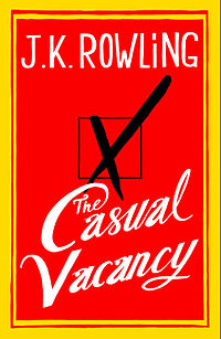
Wednesday’s Cover Story – A Cover’s Vacancy
The one news item in the publishing trade that (briefly) eclipsed Fifty Shades (enough already – we get it, porn sells!) was the unveiling of the cover design for JK Rowling’s The Casual Vacancy. To say this was a highly anticipated moment in cover design history is the understatement of the year and of course everyone had a strong opinion. Prolific designer Jon Gray dissected the choice of layout/colour etc in The Telegraph while the Guardian suggests the simple style is to keep us guessing at the story which is, of course, strictly embargoed.
Here is our own inhouse designer Christina’s penny’s worth:
It hints at the main plot device – from what I understand a by-election, triggered by a councillor’s death, in a fictional village – and as a thumbnail it absolutely screams at you, so from that point of view it works. I am a big fan of typographical covers, but like Jon Gray I don’t like it. It’s too slapdash, like the first draft of something that’s been churned out in a brainstorming meeting. I would not be surprised if the final jacket turned out to be different. My inner cynic thinks that this is just a marketing salve, something that has been released to get people talking and the pre-orders going…
There you have it – an expert’s opinion. What do you think?
Lara Crisp, Managing Editor


