Wednesday Cover Story: A cover both unoriginal and original…
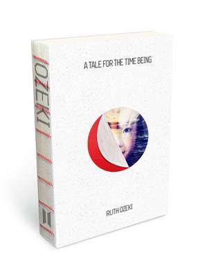
This week, Susie brought in a copy of the Man Booker Prize nominated book, A Tale for the Time Being by Ruth Ozeki , sporting a spineless design.

This would have been interesting if I hadn’t already seen this unorthodox packaging on the cookbook Pulpo (see my previous cover story blog). With Pulpo however, aside from being innovative, the lack of spine had a functional purpous, allowing the book to sit perfectly flat and open on a kitchen table, leaving the reader’s hands free to cook up a storm whilst following the recipe on said open page. (As an avid cook myself, I know how practical this is.) With Ruth Ozeki’s novel, however, I fail to see the reason behind the choice of a spineless book, given that a) it’s been done before so gets no points for originality and b) as a novel, you’re most likely just going to have it propped up in your lap. There’s no real advantage to reading a novel hands-free unless (I’m trying to think of possible scenarios) you are reading and knitting, reading and eating a bowl of cereal, reading and simultaneously petting your cat and dog or reading and holding a glass of wine in one hand and a cigarette in the other… And even then, you’d still need to use a hand to turn the pages.
Without the functional or innovative element, the spineless spine is actually not that attractive to look at, and given how beautiful some spines can be, one could argue that they’ve missed an opportunity to do something more eye-catching with it – something that may have better offset the whiteness of the cover. Having said that, it will certainly still stand out on the shelf amongst other book spines (as long as more books don’t start going down this spineless route) or it will be mistaken for Pulpo (also white and minimalist) but perhaps that’s all part of a subliminal marketing ploy (given the postitive hype Pulpo received)…
However, whilst the spine didn’t wow me, the peel-off cover did strike me as something rather original. You can peel back the red dot to reveal a woman’s face. Now has anyone seen that before? (Come to think of it, instead of the spineless option, they could have extended the front cover idea and added a peel-off-the-spine-to-reveal-the-title feature instead…)

Chiara Priorelli, Publicity & Online Marketing Manager


