Wednesday Cover Story: The age-old issue – UK v US covers
It seems this is a recurring theme – the comparison between UK and US covers.
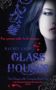
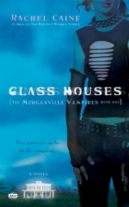
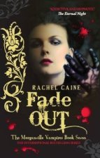
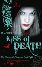
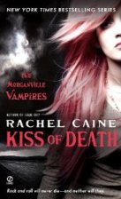
The Book Butterfly blogger recently featured a post which compared UK and US covers for various hit vampire series. Read the post here. We’ve certainly had plenty of comments about our new look for the Morganville Vampire series with the consensus amongst readers being that they favour it over the US design, and The Book Butterfly backed this up (preferring the UK version of Glass Houses to the US edition) and in general preferring UK covers overall.
It is interesting to note how some UK and US vampire series covers are so different and others so similar. Should we assume that UK and US designs need to be different because American and British readers are different? Or ultimately should we always be looking for the winning design that works on both sides of the pond?
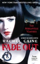
If the latter is the case, I’ve noticed that the US design for the latest Morganville releases Fade Out and Kiss of Death have started mirroring our series look, so perhaps we’re on to something…
Chiara Priorelli, Publicity & Online Marketing Manager
3 thoughts on “Wednesday Cover Story: The age-old issue – UK v US covers”
Leave a Reply
You must be logged in to post a comment.



I adore the A&B covers of Rachel’s books. I even loved the previous ones that glow in the dark.
I have wondered about the US v UK covers thing though – I love seeing what comes through and to be honest, I’ve bought in books from US because I’ve liked their covers as much, if not more, than the UK covers. But like most readers, I like the covers of my series books to be all the same/linked. Which is why I’m holding out on buying a certain author’s books until the series is finished so I can buy them in one swoop.
Is that freaky and weird?
I prefer all the US covers there, though especially the Glass Houses one. Very stylish, and that UK trickle of blood on the girl’s mouth makes me want to wipe it off with a napkin. Tsk, tsk, doesn’t she own a hanky?
All the Gothic swirling print puts me off, I suppose. We’ve seen so much of that in recent years, it’s getting old. Contemporary, sharp, modern, a bit cold and hard-edged. Maybe that’s the way we should be going for the paranormal and horror. Making it more relevant to today. More real.
I’m British, btw. So it’s not an American bias.