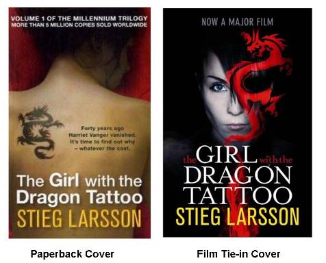
Wednesday Cover Story: The Girl with the Dragon Tattoo
I can’t get on the tube these days without spotting a poster for the new DVD release of the film The Girl with the Dragon Tattoo. And of course, you will also find the obligatory film tie-in version of the novel by Stieg Larsson in bookstores. The film poster makes an equally effective cover to the book (possibly more effective? What do you think?) but it highlights a crucial difference between the two.
On the film tie-in cover the face of actress Noomi Rapace, playing Lisbeth’s character, is clearly pictured front and centre. On the original paperback cover, Lisbeth’s face is hidden.
It highlights the common trait (and deliberate move) to hide people’s faces on book covers. The characters on the covers are, more often than not, pictured in the distance, or facing away from the reader, or cropped at the neck (see countless historical novels eg. see our own Young Bess) or blurred in some way. Because effectively the beauty of books is that the reader will conjure up their own unique picture in their heads as they turn the pages, and formulate their own image of a character in their mind. Films, as visual mediums, of course do not let you do that. Directors and producers have picked their one vision and present it boldly to you.
I wonder, for those of you who read the book before seeing the film, how different Noomi is from the Lisbeth you imagined in your heads?
Chiara Priorelli, Publicity & Online Marketing Manager
Want to flag up a cover for our Wednesday Cover Story? Write to chiara@allisonandbusby.com with your thoughts
2 thoughts on “Wednesday Cover Story: The Girl with the Dragon Tattoo”
Leave a Reply
You must be logged in to post a comment.


Interesting Blog! I haven’t seem the film yet but I have read the book, still the other two to read…
I don’t know if it was the author description or my imagination but I did picture Lizbeth as a petite brunette with a tattoo. For some reason she is a little chubby in my head and her teeth aren’t perfect.
To follow on to your blog I would say that faces on books restrict the readers imagination unless it is a biography where it is kind of a must to have the face of the person the book is about as the cover – The Third Man is the latest that comes to mind…
As a film poster, you are selling the film and the actors in them, although very popular, some people might even not realise that it was originally a book if you know what I mean. About Young Bess, I must confess that I haven’t read it but I see that it is fiction, so it applies….the Elizabeth Omnibus though interestingly has a picture of a woman with red hair and a face that looks a lot like Cate Blanchett… http://en.wikipedia.org/wiki/Elizabeth:_The_Golden_Age
See also the covers of Alfie that you publish – with Michael Caine and then Jude Law. You ‘used’ the actors of the films to attract the eyes of people that may not necessarily have bought the book but then seeing the actors on the covers, remembered there was good movies and bought copies – just speculating here.
Well, the book covers are rather clever, because book 1 hides her face, book 2 shows a profile and book 3 shows a full-front face. This mirrors Lisbeth’s journey from the shadows of book 1 to the independent woman of book 3.
I like the film poster, but it lacks the asthetic beauty of the book cover, plus the intelligent “joined up thinking” about the three novels.