Wednesday Cover Story: Innocent
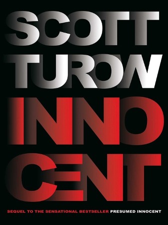
I can’t make my mind up as to whether I like this cover or not.
It is certainly eye-catching and original with the 3D effect of the lettering – it certainly stands out. However, whilst I can appreciate the design concept in itself, I’m not sure I actually like it as a book cover for a thriller. Yes, the lettering stands out but at the same time I find the cover a bit bland… perhaps the colours don’t help. It has something of a non-fiction quality to it – fits more with the idea of a book on the dark world of American finance. (Although that may also have something to do with the fact my eye is drawn to the word CENT…)
Does it make me want to read the book? I’m not sure it does, although one thing is clear – I’m certainly giving this book more thought than any other recent thrillers I’ve seen. So that says something…
What do you think about it?
Chiara Priorelli, Publicity & Online Marketing Manager
Want to flag up a cover for our Wednesday Cover Story? Write to chiara@allisonandbusby.com with your thoughts
One thought on “Wednesday Cover Story: Innocent”
Leave a Reply
You must be logged in to post a comment.


I would also have said true crime. The lettering is eye-catching but looking at it, I’ve realised how much info we’re usually given from a cover and this just doesn’t tell you very much.