Wednesday Cover Story: The Apostle (The film that never was…)
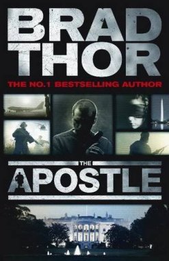
When I came across the cover to The Apostle, by Brad Thor I was sure it was a film tie-in edition. The images look like stills from a movie (do they not?), so much so that I actually Googled IMDB to look it up, as I have a penchant for war and government action-thrillers.
But no, this is not a film tie-in. There is no film. This is just clever marketing, catching the eye of those who opt for films rather than books, but might think “hey, maybe I’ll give this one a go.” It has the “blockbuster-thriller” look and you might even start picturing yourself eating popcorn while you read. The cover designer has already started the movie in your head – it’s the trailer.
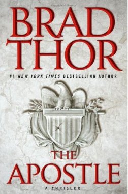
It’s a far cry from the hardback cover…
…this I would probably never pick up. It tells me nothing – in fact at first glance I would have mistaken this for a historical fiction novel (which tend to go with the emblem- look) rather than a contemporary novel – as it wouldn’t have captured my gaze long enough to register it is the emblem linked to the United States – the Great Seal of the United States or US Homeland Security – I would have just seen “eagle”…and mind would have linked it to something Roman like our own Pillars of Rome.
But the paperback, I was successfully sucked in. It says it all right there, immediately – war, action, Washington, lone hero… I’ll take it.
On a side note, the stills layout actually reminds me of a poster for another movie which I can’t put my finger on now…and it’s driving me crazy. (And if any of you A&B blog readers know which one I’m thinking of, please tell me and put me out of my misery.)
Chiara Priorelli, Publicity & Online Marekting Manager
Want to flag up a cover for our Wednesday Cover Story? Write to chiara@allisonandbusby.com with your thoughts


