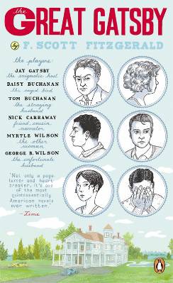
Wednesday Cover Story: Modernising the classics with the new Penguin Essentials
On Monday, Georgina (our Editorial Administrator) flagged up the fact she was loving the covers to the new reprints of the Penguin Essentials. Then yesterday at the London Book Fair, Joe Pickering, publicist at Penguin, mentioned them in passing (nicely done, Joe) in the seminar Tweet Success about social media. (Yes, this one of the many oversubscribed seminars which left hordes of unhappy LBF-goers barred from the room, but I was one of the lucky few who made it – barely, confined I was to standing in the open doorway).
So today, I feel somewhat fated to showcase the Essentials as Wednesday’s Cover Story, although I must admit I’m less enamoured by the covers myself. I find most of them a bit too ‘fussy’ for my liking – although I admire the idea behind the designs: getting various contemporary artists without book-design backgrounds to create the covers for these classic novels (read more about the designs in the Penguin Blog here). The aim was to create something ‘fresh and different’ and if the cover to The Great Gatsby is anything to go by, ‘different’ they certainly are…
As to whether I actually like this ‘different’ approach? Well, I guess I’m more of a classic girl…
But what do you think of them? See all the covers here…
Chiara Priorelli, Publicity & Online Marketing Manager
Want to flag up a cover you love or hate for our Wednesday Cover Story? Write to chiara@allisonandbusby.com with your thoughts


