Wednesday Cover Story: Third time’s a charm…
Every day, for the past few weeks I’ve been admiring the cover for A Discovery of Witches, by Deborah Harkness (there’s a poster advertising the paperback as I head to the Northern Line at Waterloo station on my morning commute). It’s a beautiful juxtaposition – the silky, light strands of red contrasting with the stark, black city landscape below.
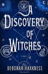
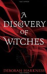
Although I wouldn’t usually be interested in reading about witches, I was entranced enough by the cover to go on Amazon and see what it was about. In doing so I saw two different covers for the book – the American hardback edition and the earlier UK hardback edition – and I have to say I feel the new UK paperback design surpasses both by a mile.
The American edition is a much more obvious take on the witches and spells theme and would put off someone like me who is not an avid witchy-fan; whereas the UK hardback…well, it’s a bit slicker (and I like their introduction of that interesting ‘C’ in ‘Discovery’) yet it doesn’t really pack much punch. The third and current design for the UK paperback, however, is a wonderful development of this hardback theme, cleverly blending the look of a literary, thriller and fantasy novel and I think, unlike the American version, beautifully broadens the appeal of the book.
What are your thoughts?
Chiara Priorelli, Publicity & Online Marketing Manager


