Wednesday Cover Story: The Marriage Plot
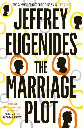
When I first came across The Marriage Plot (in the form of a very large poster in the London Underground) I thought, ‘Here we go, another cover design trying to ride on the back of One Day‘s success’. They had blown up the silhouette of the girl and the boy on the poster for a David-Nicholls-book-look-alike effect. If the poster actually featured the full book cover on it, I missed it as I scurried past.
However, now that I’ve actually seen the book in the flesh, the cover is, in fact, more original than I thought. The silhouettes are present, the now iconic One Day-orange-colour is present, but the similarities between the two covers pretty much end there. And this one does stand out very nicely as a cover. It makes me wonder whether book cover designers should be doing more with polka dots and circles as they definitely catch your eye.
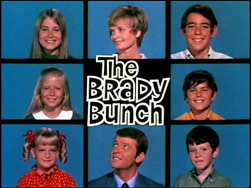
On a side note, when I first looked at it, the cover actually made me think of the opening credits for the The Brady Brunch (something about the floating heads and geometrics), but maybe that’s just me…
Chiara Priorelli, Publicity & Online Marketing Manager


