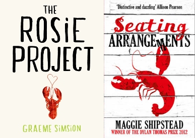
Wednesday Cover Story: Crustaceans Covered
Like anything, when it comes to book covers there are trends, but I wonder whether here in the UK our designers might be thinking with their bellies of late. I didn’t expect two books this summer to catch my eye thanks to a bright orangey-red lobster slap-dab in the middle of a fresh white cover.
Definitely eye-catching, don’t you think? The fonts also seem akin as well in their block printing style. As it happens, I took The Rosie Project with me on holiday the other week and, unfortunately for me, sped through this charming book far too quickly. I can’t speak for Seating Arrangements, but I know that while a lobster or two does crop up but isn’t integral to The Rosie Project. So it amuses me that the UK designers both looked to the characters’ dinner plates for inspiration, while overseas publishers have taken very different tacks with their designs. It’s enough to make me hungry…
Lesley Crooks, Sales & Digital Manager


