Wednesday Cover Story: Designing with apps
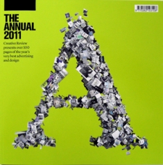
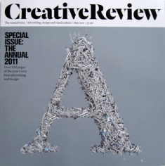
A while ago I came across the article about how the cover to The New Yorker had been designed using Brushes, a new app on the iPhone. This week, I see that the cover to the Annual issue of Creative Review – which always involves a different treatment of the letter ‘A’ – has also been created with the use of an app. The app in question, developed specifically to design this magazine cover, is aptly called The Annualizer and it managed to ‘slurp’ (yes, I believe that is the technical term) every image from the CR Blog over the past year to create the letter A. The same ‘slurping’ process was used for the cover to the magazine’s May issue, this time using text from the CR Blog and Twitter account to generate the ‘A’ image.
Read more about the CR Annual cover here…
A far cry from the pencil and sketch pad… Having dabbled in the art of creating book covers myself, I used to think my knowledge of InDesign and Photoshop would label me as a relative connoisseur of ‘technical’ art. But looks like it’s necessary to be app-savvy too.
I have to admit, I do love the concept behind the Annualizer-ed ‘A’ and perhaps this could inspire future book covers. An anniversary edition of a classic novel – sporting a cover design that amalgamates all the images ever featured on all the different editions of that particular book? Any other possibilities you can think of?
Chiara Priorelli, Publicity & Online Marketing Manager


