Wednesday Cover Story: Setting the scene…
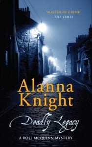
This month’s issue of Booksmonthly features a review of the latest paperback in The Rose McQuinn series by Alanna Knight, Deadly Legacy, set in Edinburgh in 1901. The review says: ‘The atmosphere is superbly created and executed – the cover image sums up the narrow, lonely back streets that Alanna describes, and the story is beautifully crafted and builds at a satisfying pace. Wonderfully believable characters and a faultless plot. These stories are crying out for dramatisation.’
It is often difficult to find images that match (precisely) the content of a book (and, in fact, designers often steer away from anything too literal) so we were pleased to hear that, at least in this reviewer’s opinion, the alleyway on the cover to Deadly Legacy successfully and accurately evoked the atmosphere and setting of the novel.
One could argue that having a cover that immediately ‘sets the scene’ with a very visual picture (in this case of those ‘lonely back streets’ of Edinburgh) also helps to kick-start the ‘movie’ in your head which evolves as you read a book. Perhaps the cover played a small part in making the reviewer imagine this series on screen? I can indeed immediately picture a scene taking place under the lamplights of that dark street…
Do you find that covers featuring a more visual, literal setting, helps to create a movie in your mind?
Chiara Priorelli, Publicity & Online Marketing Manager


