Wednesday Cover Story: The 19th Century Poster Look
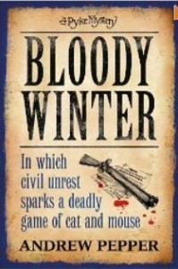
I’ve just come across the book Bloody Winter, by Andrew Pepper, due out next week. It’s the latest Pyke Mystery and I’m loving the series look which hints at a 19th century poster rather than a book cover – where the text takes centre stage rather than an image. And I particularly like the use of the old-school descriptive straplines eg. In which civil unrest sparks a deadly game of cat and mouse…
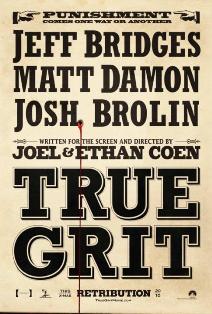
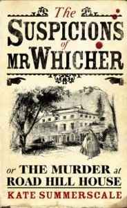
From the cover I actually thought Blood Winter was something of an American western (rather than being set in the UK), possibly as I’d recently been looking at the film poster for True Grit with that same text-based design as old-fashioned notices. The headline-style title also reminded me of the memorable cover to the very popular The Suspicions of Mr Whicher, by Kate Summerscale.
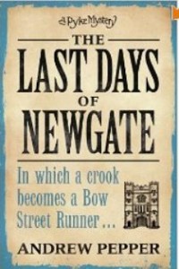
I note, however, that the clever design style for the Pyke novels began a with The Last Days of Newgate published in 2007, a year earlier than Mr Whicher – so perhaps the Pyke mystery series can claim to have started the trend?
Can you think of other covers that have adopted this 19th century poster look?
Chiara Priorelli, Publicity & Online Marketing Manager
Want to flag up a cover you love or hate for our Wednesday Cover Story? Write to chiara@allisonandbusby.com with your thoughts


