Wednesday Cover Story: The decision about delicious cover finishes…
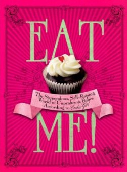
In the office earlier today Christina (Art Editor) and I we were discussing the Ebury press publication Eat Me, by Xanthe Milton, and what finishes it had been printed with.
It’s a regular conversation between Christina and I as we battle it out trying to decide on foils, embossing, spot uv and coloured end papers for our own books. These finishes are the book’s accessories, the finishing touches that make them covetable and prevent them from looking bland.
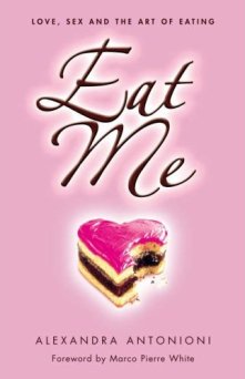
Chiara piped up that she had a copy of Eat Me at home that she would bring in so we could have a look at the finishes. But it turns out her book is something entirely different – this one by Alexandra Antonioni – although also pink and complete with similar edible pastry. It’s not unusual for books to share names, but for the covers to look so very similar too is a surprise.
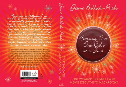
The reason we were discussing Eat Me is that we are bringing out a baking memoir next year, the much anticipated Starting Over, One Cake at a Time by Gesine Bullock-Prado, Sandra Bullock’s equally talented younger sister.It’s a fine cover design as you can see, but how to make the finished product as beautiful as the image on screen?
So what did decide for this book? A chocolate-coloured wibalin, hot pink foil and spot uv and embossing on the jacket.
Such a beautiful book deserves to be well-accessorised, and you’ll be able to see the results in March 2011!
Lara Crisp, Managing Editor
Want to flag up a cover for our Wednesday Cover Story? Write to chiara@allisonandbusby.com with your thoughts


