Wednesday Cover Story: The Home Front Detective gets a new look for paperback
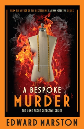
We’ve talked in the past about how paperback covers are often completely different from the respective hardback covers. Designs that work well for a hardback book won’t always transfer well to a smaller paperback edition. And here is a perfect example. The cover to A Bespoke Murder, by Edward Marston (the first in his new Home Front Detective series) was very striking with its bright orange border and flaming mannequin which stood out brilliantly in the large format of the hardback edition.
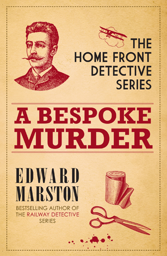
But it wouldn’t work as well or have the same impact in a smaller paperback format and so we opted for a completely different design for the upcoming paperback release (out next month). The focus is no longer on a central image but instead on typography, and instead of bright colours we’ve gone for muted tones for a more old-fashioned look.
I love the new approach and interestingly think this design could have worked just as well in hardback too. Some designs (whilst equally striking in themselves) are compatible for both formats, others simply not.
Chiara Priorelli, Publicity & Online Marketing Manager


