Wednesday Cover Story: The sideways cover…
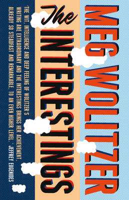
This week I came across the book The Interestings, by Meg Wolitzer, which (as far as titles go) sounded, well, yes, you guessed it, interesting. But what I found most interesting (ok, I’ll stop it now) was the cover.

I’ve mentioned before that I have a penchant for typographical covers, and I like the designs which break the more classic moulds. There are many books I can think of that play with horizontal colour strips, but I love that this cover takes it a step further, rotating the text for a vertical-strips design, confusing what side would normally be considered the ‘top’ of the book. You do get the urge to flip it. We’d been discussing how important book spines were in the office recently and when I first spotted this cover, I actually thought I was looking at a picture of three spines of different books. Whether this was a deliberate illusion or not, it all adds to the more innovative design.
Have you seen any other covers that mirror this look? And how far could you push the boat…any effective upside-down covers out there?
Chiara Priorelli, Publicity & Online Marketing Manager


