Subtotal: £9.99
Wednesday Cover Story: Working the Trend
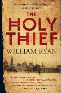
It a very very common current trend to play with parched-paper/sepia-like backgrounds and the dark sillhouette of a figure, in order to create an evocative book cover. Let’s take Jed Rubenfeld’s The Interpretation of Murder, and the Shadow of the Wind, by Carlos Ruiz Zafón to name but a few. But there’s one cover following this trend which I particularly like – that of The Holy Thief, by William Ryan.
Perhaps it is the fact that the sillhouetted figure is further away in the distance, creating a better effect as a lonesome figure against that stark background. Moreover. the city skyline immediately places the book in its Russian setting (a country whose history I am fascinated by) and the striking font and deep Russian red of the title works particularly well against the pale background. I even like the use of the black left border – not just a nice effect of torn paper, but because it almost adds a 3D effect, nicely contrasts too with the pale image, and brings out the black of the author’s name and the figure in the distance. All-in-all, I think it is very eye-catching and I may very well end up buying a copy.
Chiara Priorelli, Publicity & Online Marketing Manager
What do you think about it?
One thought on “Wednesday Cover Story: Working the Trend”
Leave a Reply
You must be logged in to post a comment.

 The Ullswater Undertaking


Funny enough, I was just browsing my bookshelves at home the other day and noticing how many books followed this trend. But they are the most striking on the shelves and I think the parchment says ‘historical’ and (more or less) ‘literary’ so you have an idea of the books’ contents already. The Book Thief is another one, and to a certain extent so is our very own Hotel on the Corner of Bitter and Sweet.