Wednesday Cover Story: Would you agree with Dazed and Confused?
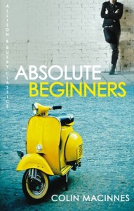
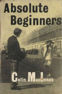
We have recently republished the great classic Absolute Beginners, by Colin MacInnes and it was picked up by Dazed and Confused magazine who featured our rerelease in their July issue (currently on sale). We get top marks from the mag – ‘big-ups and all kudos to A&B’ – for bringing this London ‘yoof novel‘ back in print. But we somehow have managed to disappoint the mag with our ‘jazzy yellow new jacket image’. In fact, they ask the question: ‘Is it just us, or is the original one for the 1959 first edition about a thousand times better?‘
Now, never one to shy away from criticism – especially as covers are such a subjective thing – we thought we’d flag the comment up here. Of course, needless to say, we feel rather differently about the cover ourselves – I for one, personally love that splash of yellow, and the image ties nicely with other editions of the book as mentioned here.
The fact is, giving classics a modern revamp only helps to bring these great reads to a new generation and I highly doubt the 1959 edition would catch anyone’s eye on a table of arresting covers at Waterstone’s in this day and age.
But the question is posed – would you agree with Dazed and Confused? Or do you feel differently?
Chiara Priorelli, Publicity & Online Marketing Manager
One thought on “Wednesday Cover Story: Would you agree with Dazed and Confused?”
Leave a Reply
You must be logged in to post a comment.


Colour is good but to much emphasis on the scooter and not enough on the character, which is what the book is actually about. BTW the 1959 cover shot is by Roger Mayne who the main character is loosely based around… and Peter Blake did a great cover for a later edition of the book